aeryfairy apothecaryBrand Design
AeryFairy Apothecary is a safe space for modern mystics, dreamers, and believers.
What began as a passion project evolved into a small business blending Law of Attraction with self-care. Its products serve as tangible tools to support spiritual growth and help customers align with their desires.
The name AeryFairy is inspired by the British term “airy fairy,” often used to describe something impractical or idealistic—acknowledging that the brand’s philosophy may not resonate with everyone.
The logo features florals and a handwritten typeface, reflecting the earthy, handmade nature of the products.
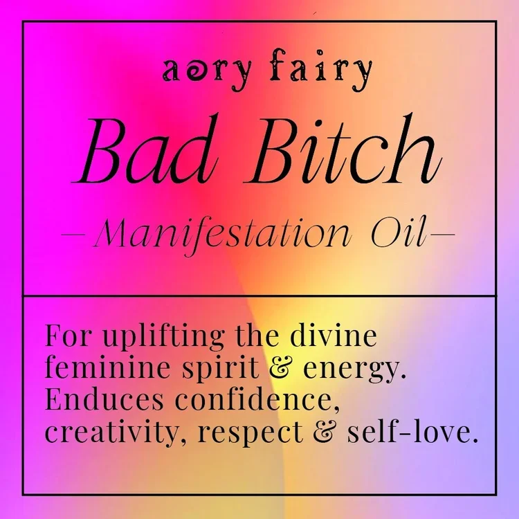
APOTHECARY FOR MODERN MYSTICSManifestation Oils
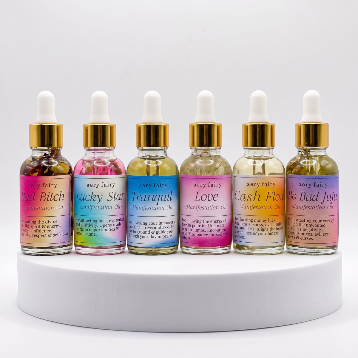
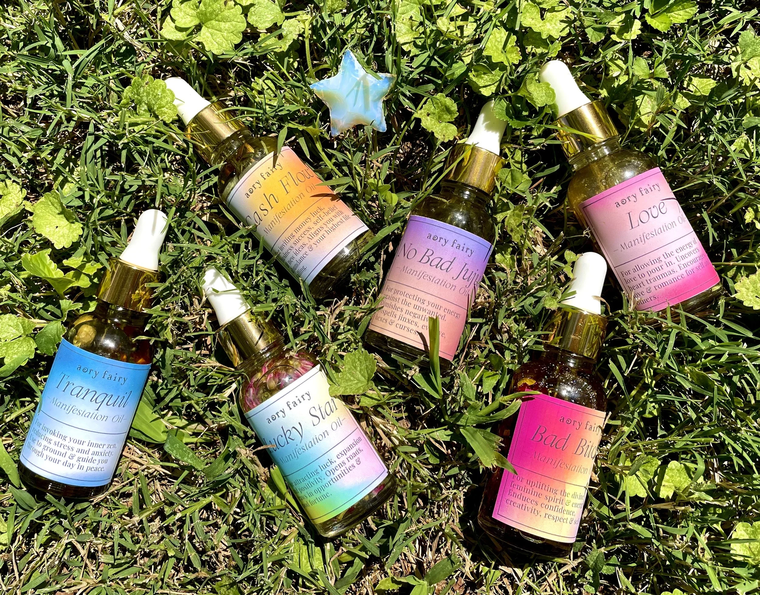
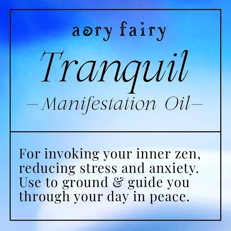
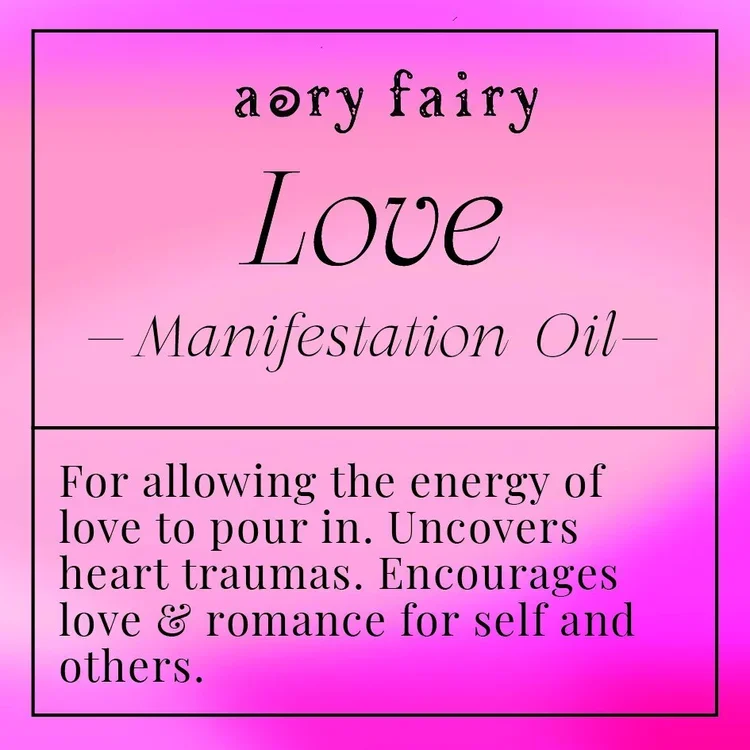
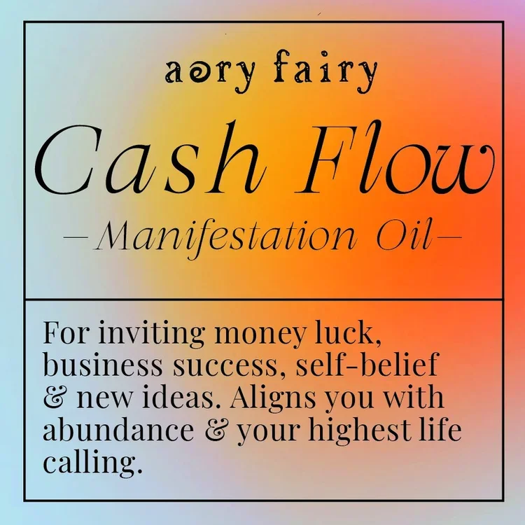
Manifestation Oils are an energetic blend of plants, herbs, and intentions to create a supercharged mix to help you attract various desires. They are the highlight and core of my brand identity.
"energy as color"Brand Theme
In the beginning, the design for AeryFairy Apothecary was reminiscent of antique & cottage-core, similar to that of an old Fairytale book.
As I grew with the brand, I began to see AeryFairy as Energy that is represented by various colors.
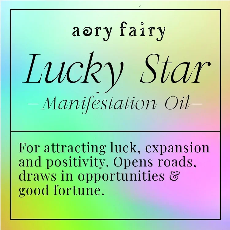
01 lucky starRainbow hues that depict the possibility of hope, luck, and a bright future.

Soft shades of blue that resemble clouds and ocean waves as the ideal representation for going with the flow and releasing control.
02 tranquil
Delicate waves of soft pinks showcase the energy of love through symbolizing receptivity, kindness, and warmth.
03 love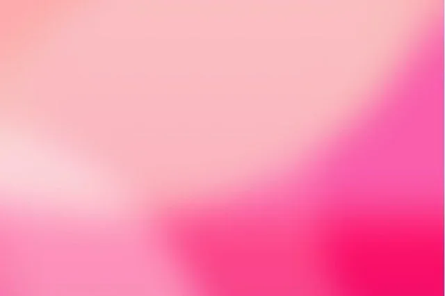
04 cash flowThe saturated spot with orange and yellow hues amidst a neutral blue speaks of risk-taking & passion, to which generosity is magnetized.

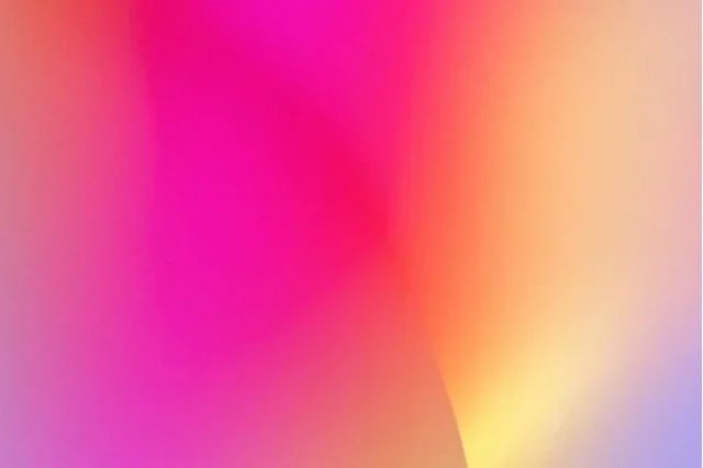
05 bad bitchBold feminine energy is being shown by neon and soft shades alike. This represents the duality of a woman’s nature. Confident, vibrant yet alluring and contained.
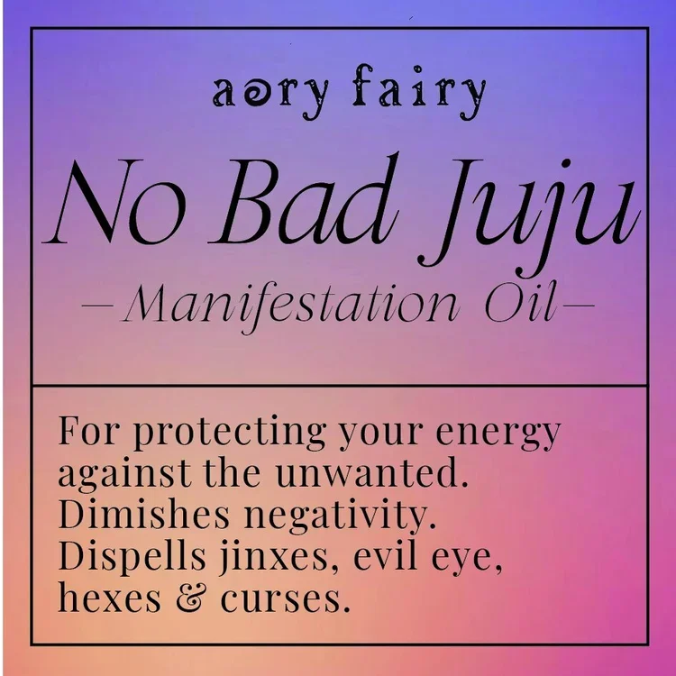
05 no bad jujuThe juxtaposition between shades of purple and orange visually depict the ebb and flow of life. Light cannot exist without the dark and vise-versa.